In our first article, we talked about a project where the house was completely renovated, where we started from scratch after a demolition.
There are some lucky situations in which the structure of the house is already quite good and doesn’t need radical intervention, just a little work on the last furnishing and on the atmosphere of the house.
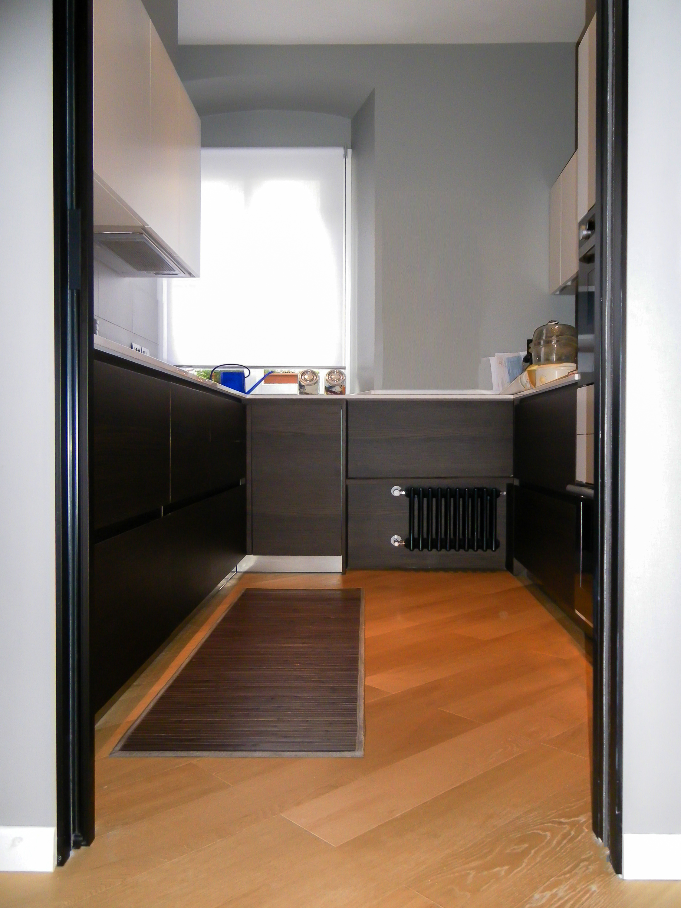
The apartment I’m showing you today is an 80 square metre home in the historical centre of Trieste, in a building from the beginning of the 19th century, very close to the Ponterosso canal, with good quality and rationalized spaces, just a little anonymous. The owner had bought it a few years back while the building was undergoing a total refurbishment, and had dedicated a lot of time in filling it with furnishings, objects and art that he collected during his travels. It already was a very nice house, warm and welcoming, but over time a few problems had started to occur so he finally decided to intervene to solve them. In particular, the kitchen, which opened up onto the living room and was perfect for the many dinners he held for his friends, always looked messy and was badly arranged, wasting a lot of useful space.
The bathroom was quite small with very little space to move about, with a very small sink and an imposing bathtub. The second room where the owner had his many guests stay, had turned into a large and very messy wardrobe.
The work we planned was to give the house a fresh look, with new floors, furnishings and colour, closing the kitchen off from the rest of the house but with the option of opening it up towards the living room table during dinner parties. We also planned a change to the bathroom spaces, putting a shower in instead of the bathtub and turning the second room into a tidy closet space and study that could on occasion be used as a guest room.


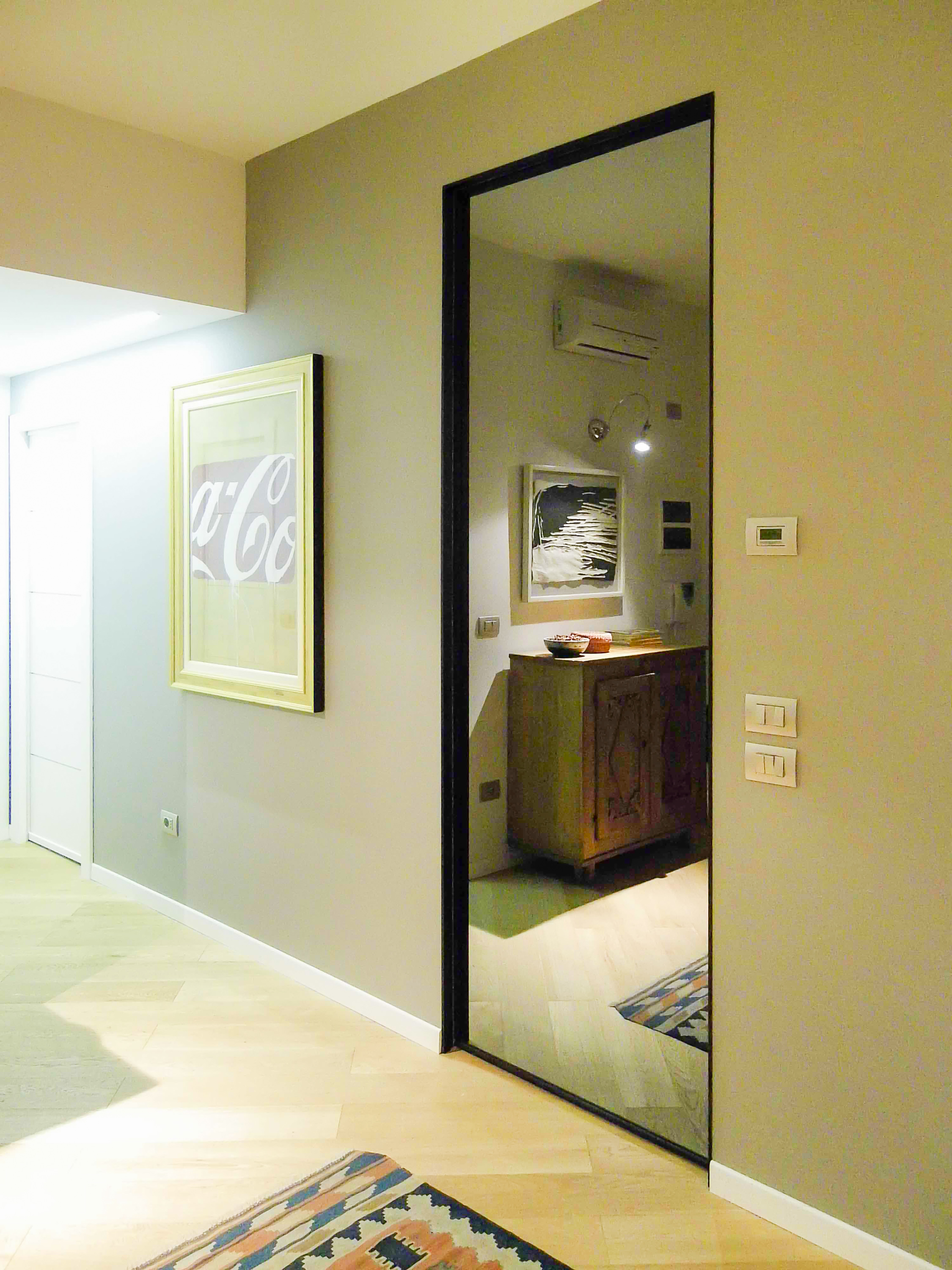
In the living room, we swapped the living space with dining space, bringing the table closer to the new large glass door that opened onto the kitchen, that was finally closed off. To better access the bathroom, we moved the door and changed the furnishings, with a large mirror that helped make to room look larger and a large shower with a huge image printed onto the aluminium so it could be water resistant.


A new wardrobe, long and narrow, was fitted into the master bedroom; this way we had more space to rethink the second bedroom, where one wall was furnished with a structure that can be used as a storage closet, a small desk was placed under the window for a computer and a sofa bed for guests completed the look.


The furniture in the rest of the house wasn’t changed, but repositioned around the house to make it look more interesting, while a lot of work was done on studying the correct repositioning of the many picture frames the owner had, and using the right lighting so they could be admired and appreciated.
Sometimes all you need are a few changes to make your house look nicer and more welcoming, a few tricks of the business that can help you multiply the space that would otherwise look small and inconvenient.
Buon gusto a tutti!
Ross

