People often ask me what goes through an architect’s mind when he’s facing the “white sheet” of an apartment to be renovated. My answer is simple: “a pinch of creativity and a good dose of folly”.
In the project I’m showing you today, folly is definitely the part that dominated on everything and that pushed me to make brave choices with a great effect.
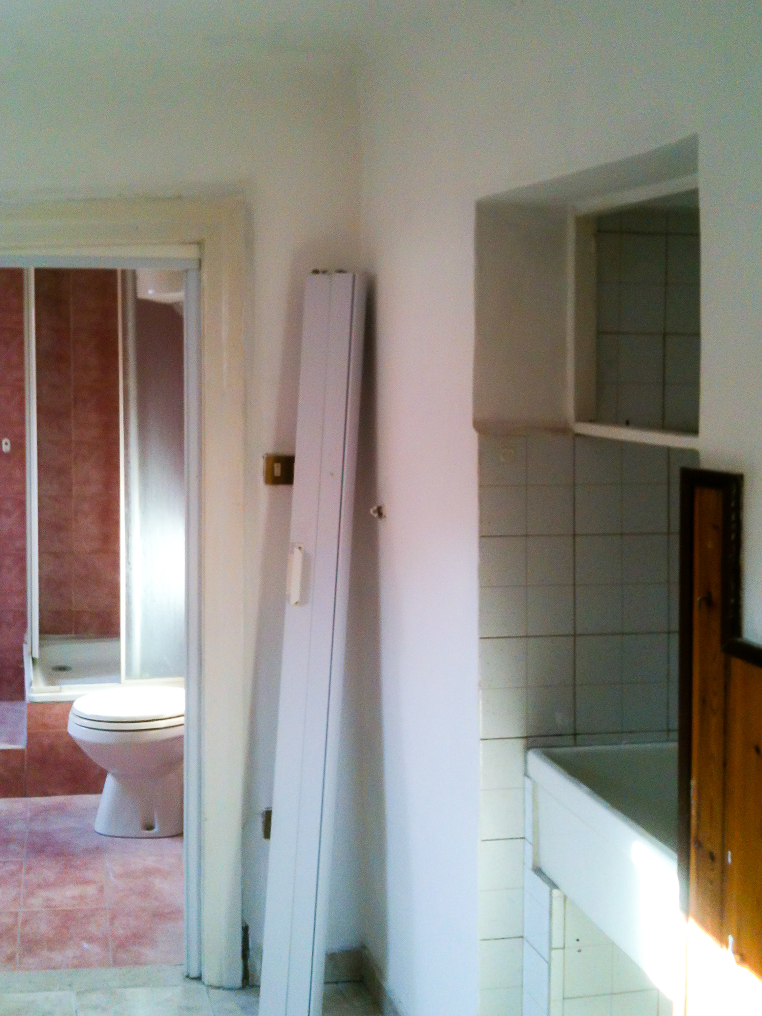
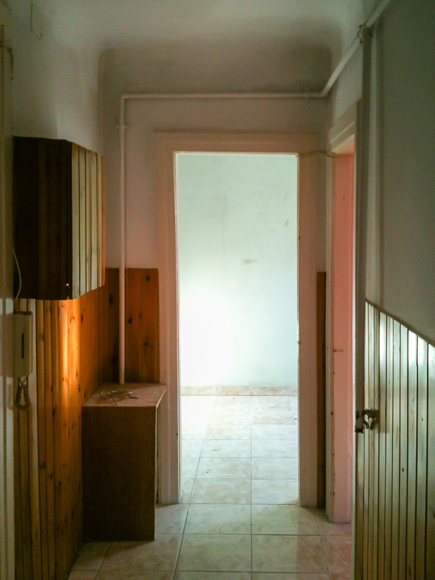
The apartment was in a terrible state: a small attic, in a building from 1862 that had been renovated in its common areas. The apartment was divided into 4 small rooms, each painted a different colour – and what colours: mint green and shocking pink! – old and ruined flooring, wooden matchboard on the walls, a pink bathroom and a small stove to heat all 4 rooms. Anyone would have just ran way from such a place, but my brave – and mad – client decided to accept the challenge and obviously passed the problem onto me.


The goal was to turn it into a welcoming apartment for a young single man. With a limited budget that had to include the building expenses, the material and the furnishings. But with a house in such conditions, where do you start from? Usually the best idea in these situations is to demolish everything and start over.
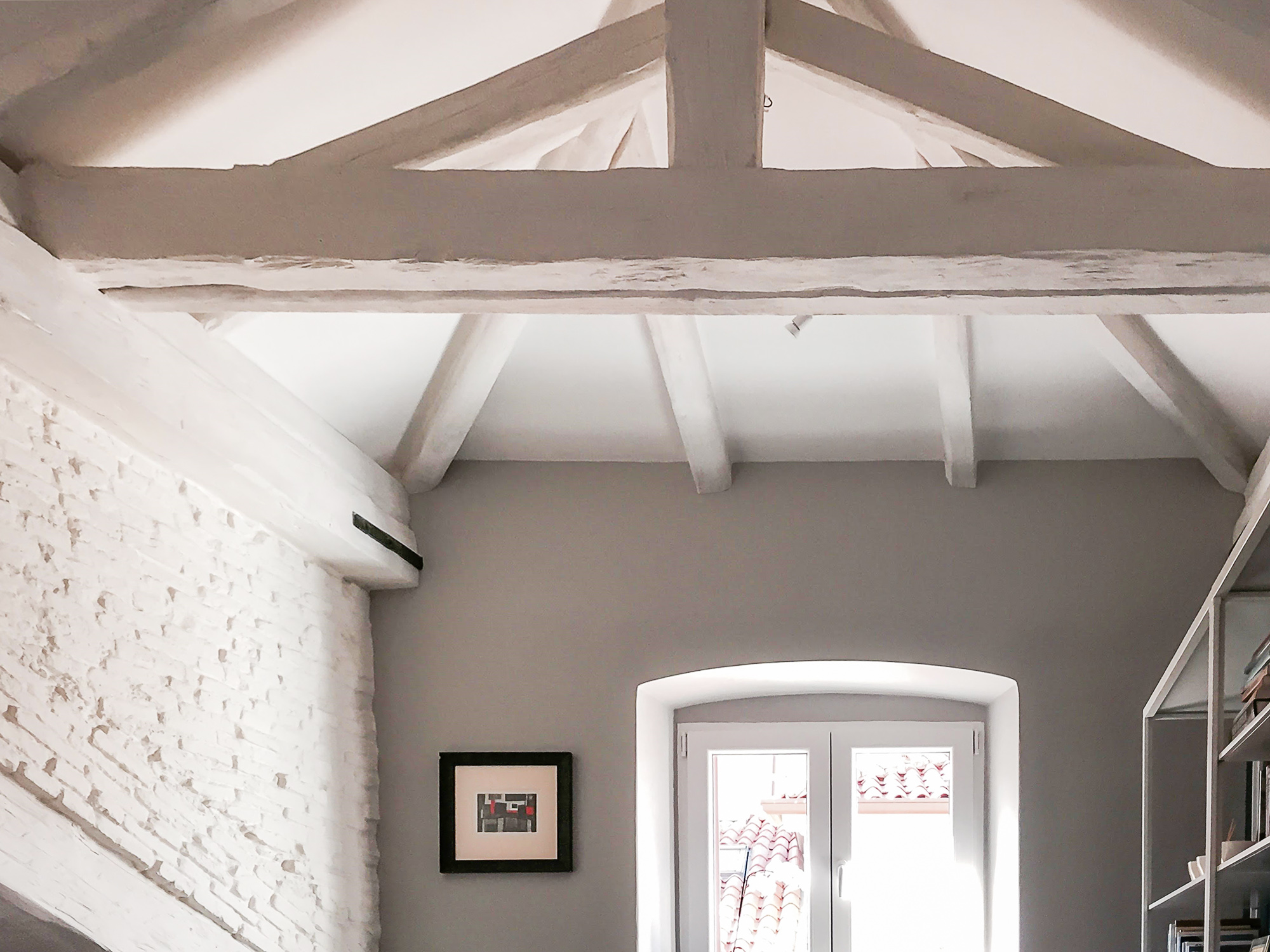
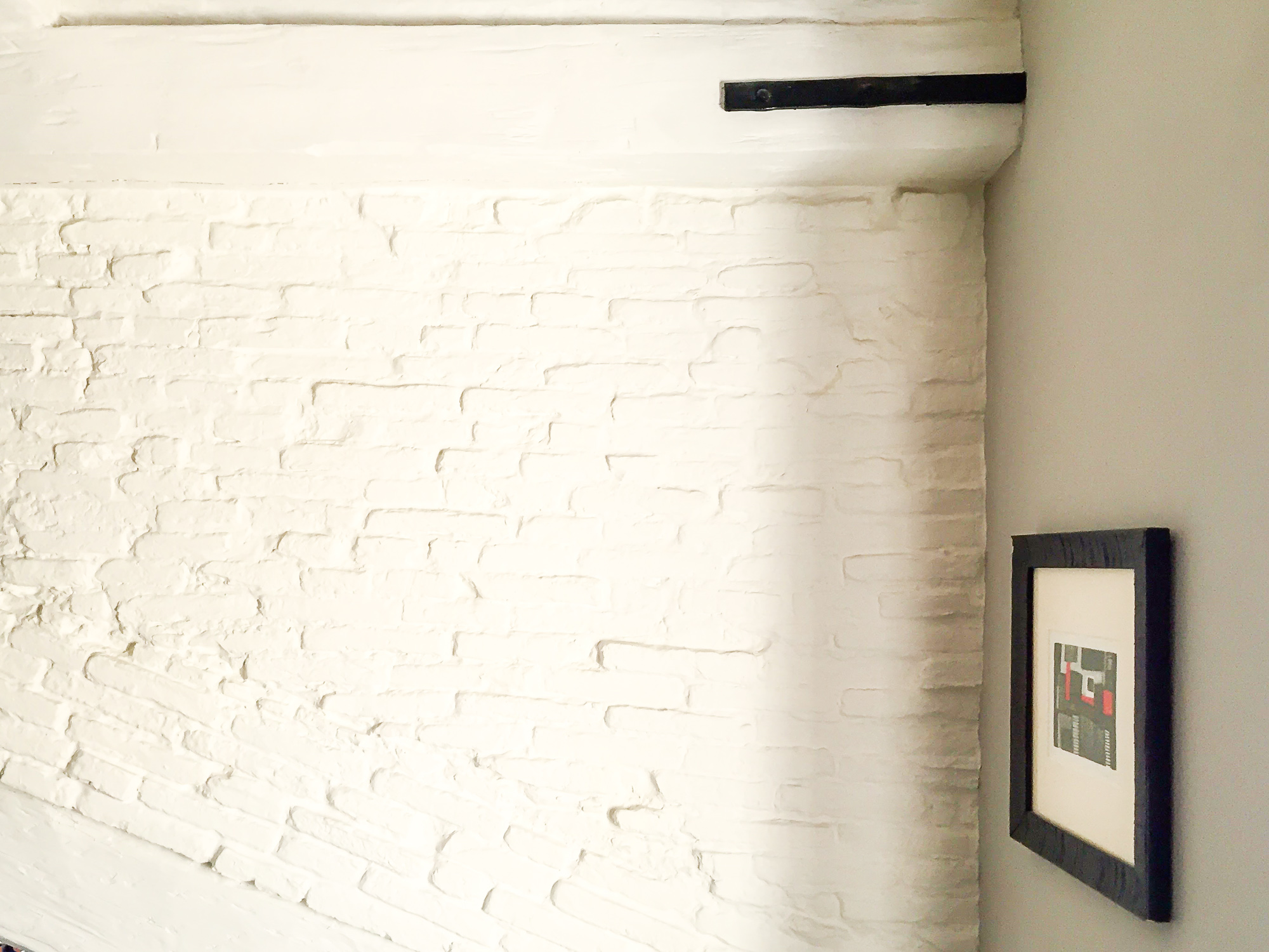
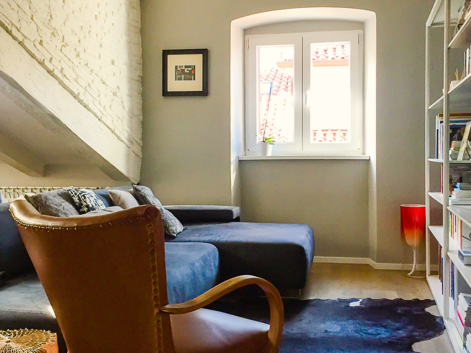
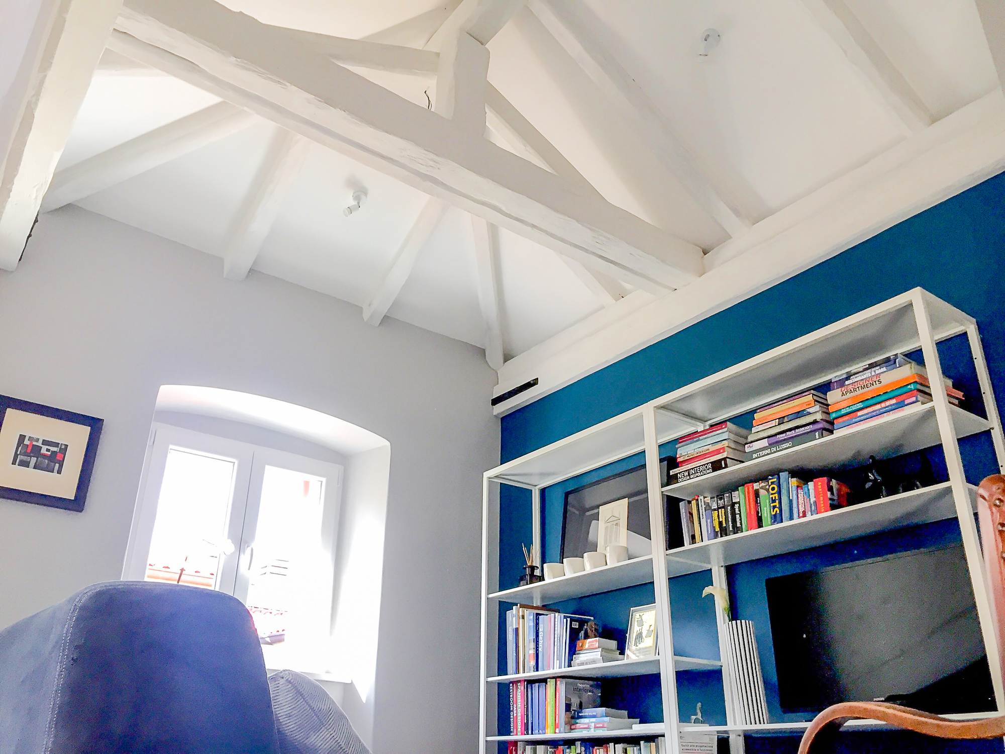
And it was during the demolition that we found the first surprise: the original A-framed wooden beams of the roof, hidden under the false ceiling. And then the second surprise: a perfectly conserved original brick wall. What looked like an ugly suffocating attic, was starting to look like a lovely open space filled with great personality.


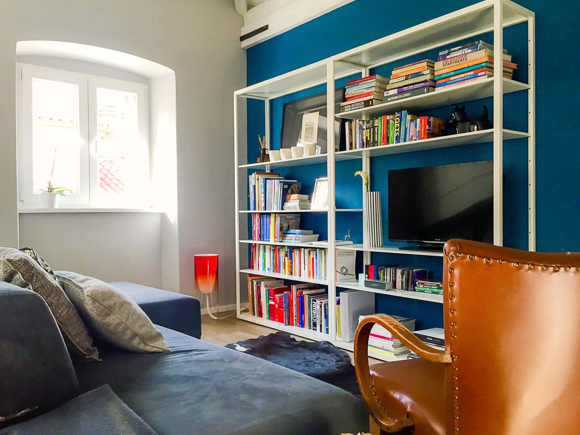
But my client’s challenge wasn’t over: as well as a sitting room that could comfortably fit his friends for a dinner or for a cinema evening in front of the TV, with a nice comfortable sofa, he also wanted a bathroom with a double shower and a bedroom with a double bed, a large wardrobe and a laundry room in which to hide the washing machine because “it just doesn’t look nice in the bathroom”. And all this in a 50 m2 space, a third of which has such a low ceiling that a 10-year-old couldn’t stand straight there.
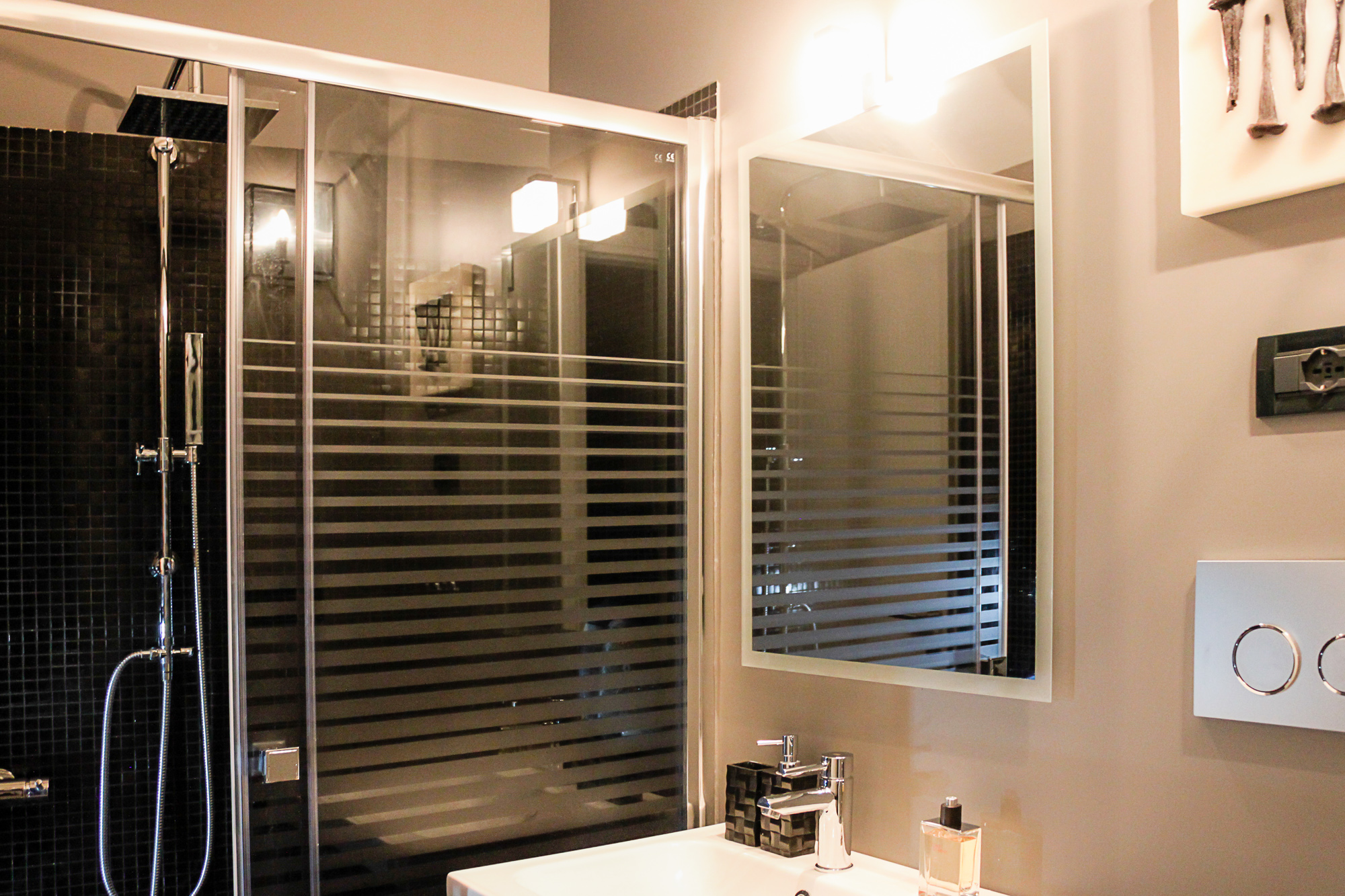
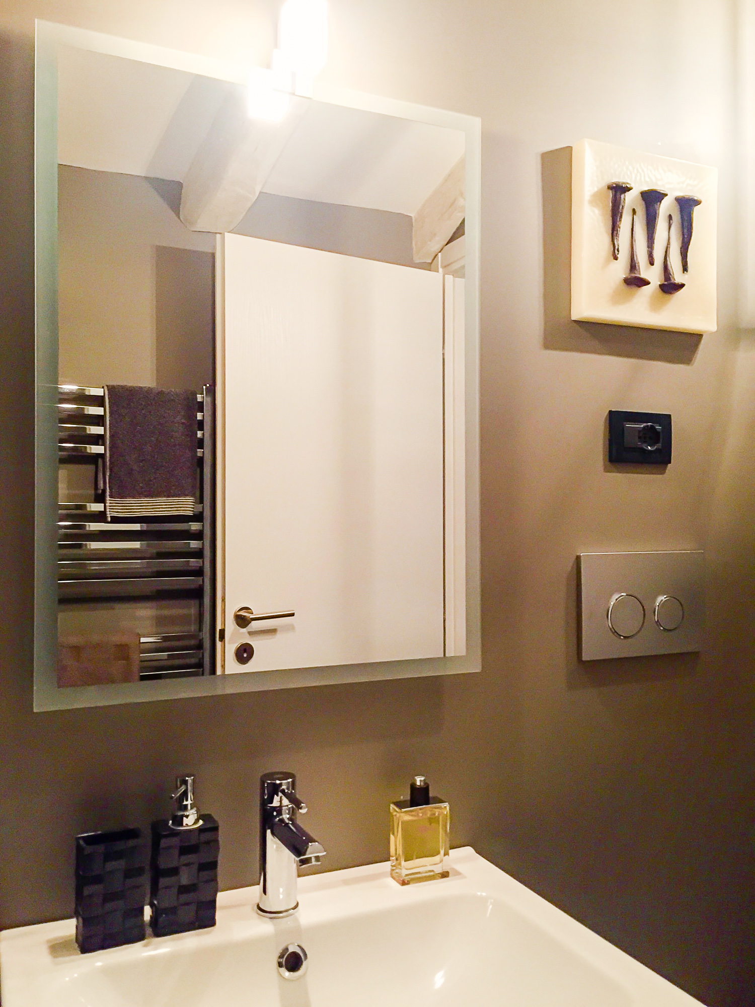
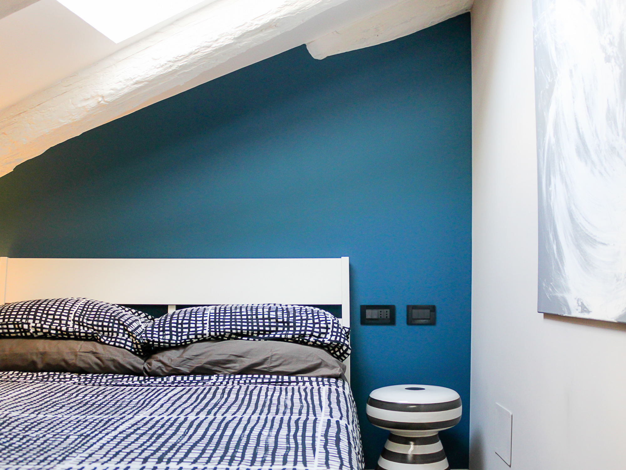
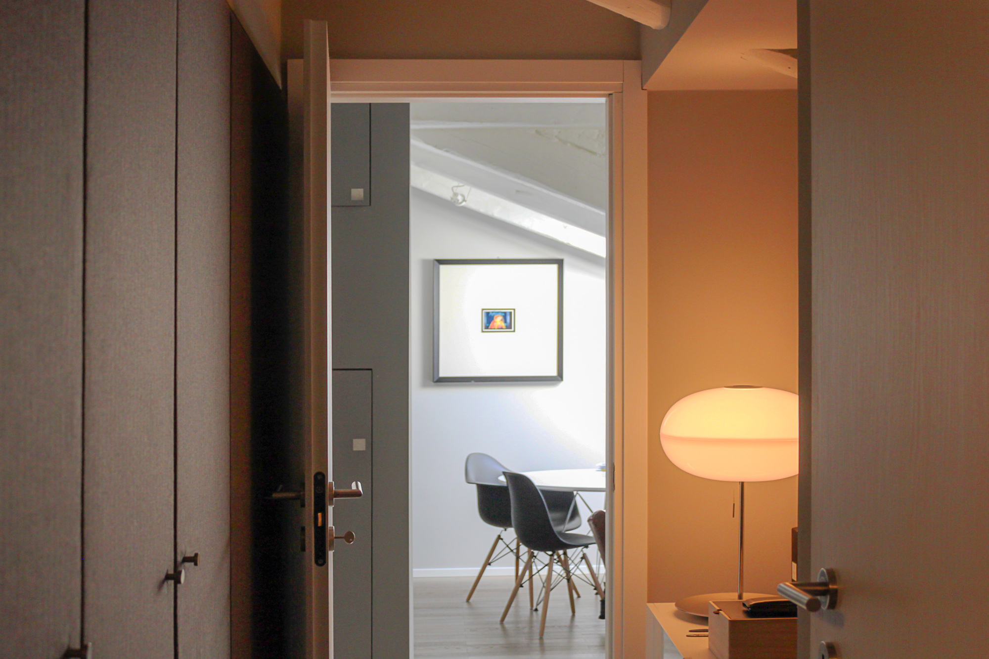
So I decided to rationalize the spaces as much as possible, by dividing the empty space of the apartment: half for the day area with everything my client wanted and half for the night area with a corridor to connect them - in which I put the wardrobe - a small but functional bathroom and a bedroom in which I put just the few essential elements.


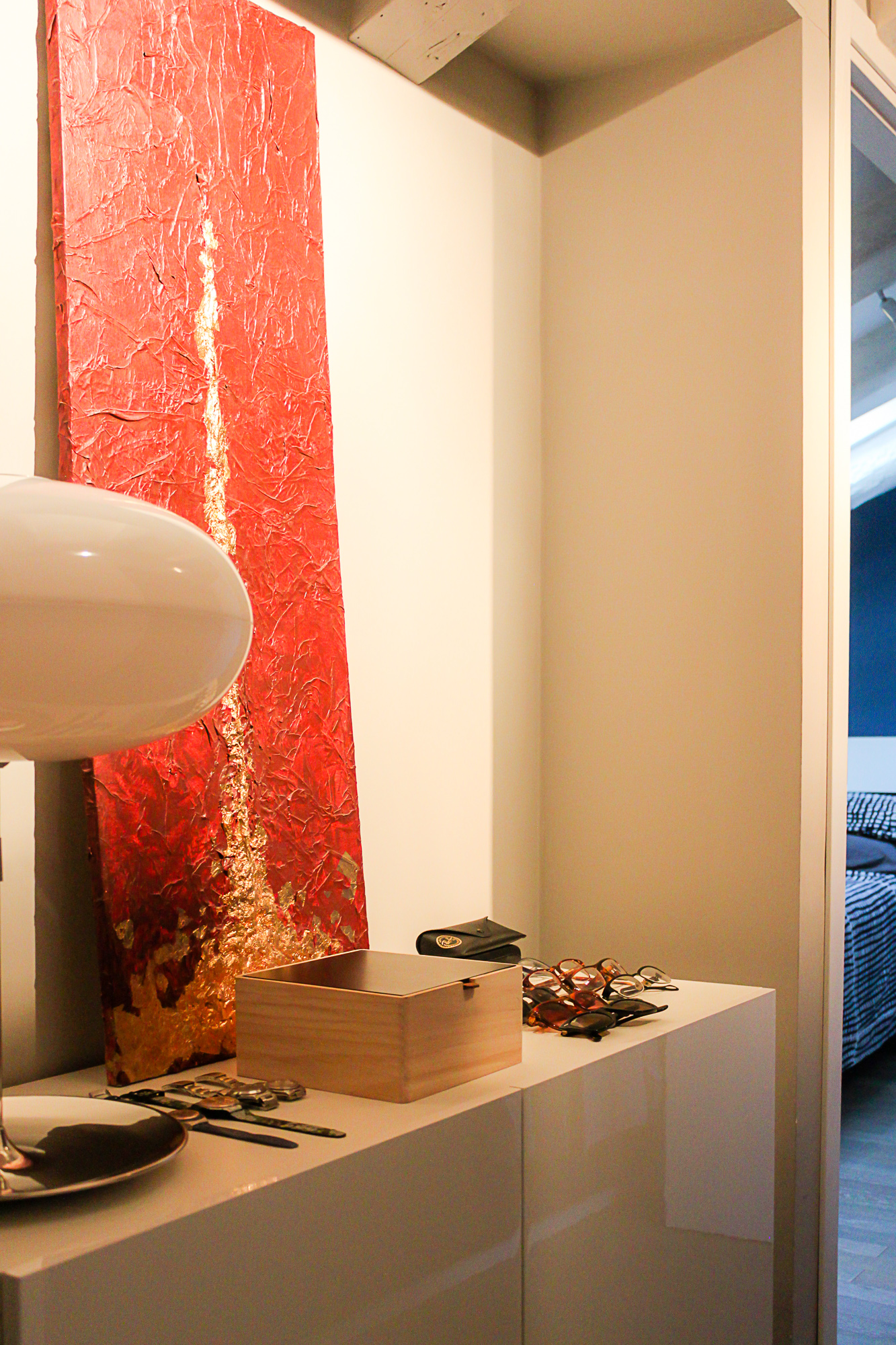
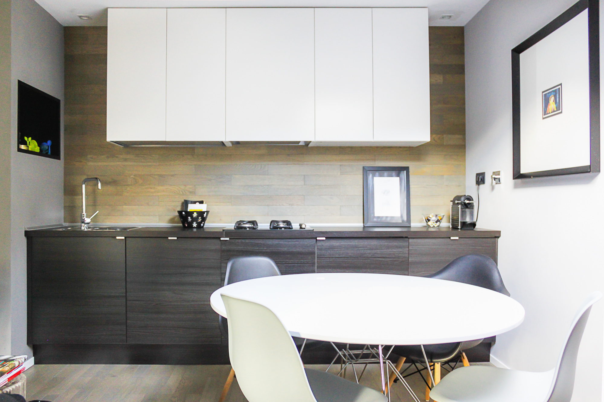
I had to keep to the budget, so I gave up on the idea of custom made furniture and I kept going in the opposite way: once we bought the standard furniture we then planned the walls around them. And to personalize the furnishing as much as possible, we covered the doors of the simple well known Swedish furniture in foam and a sober fabric with a great design. And at the entrance in a little niche closed off with “invisible” doors, we made a small laundry room, which also hides the kitchen area from the view as you walk in. The result? The kitchen and wardrobe look custom made and the washing machine is well hidden!

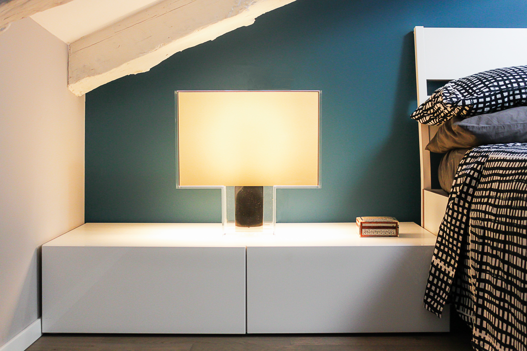
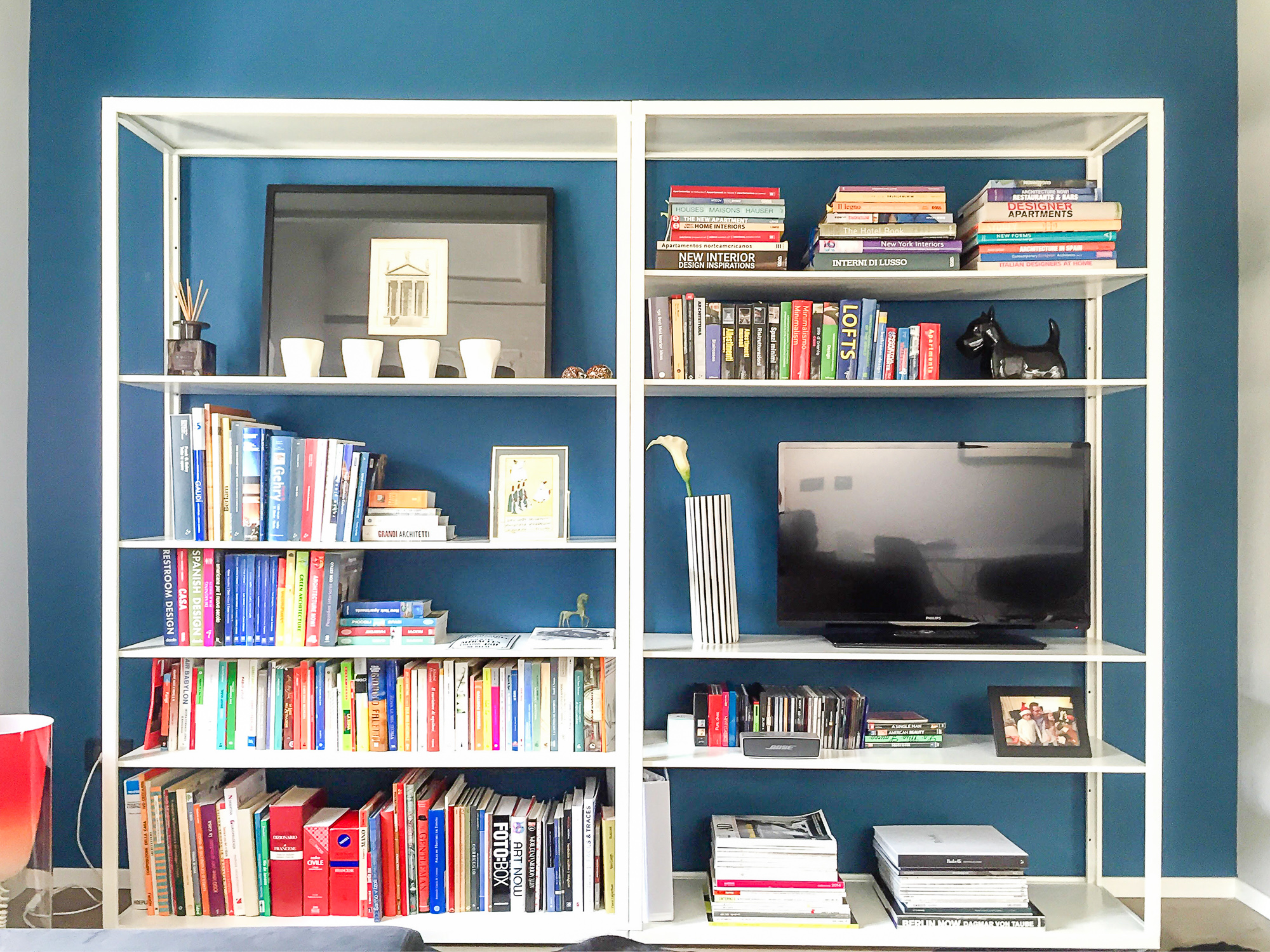
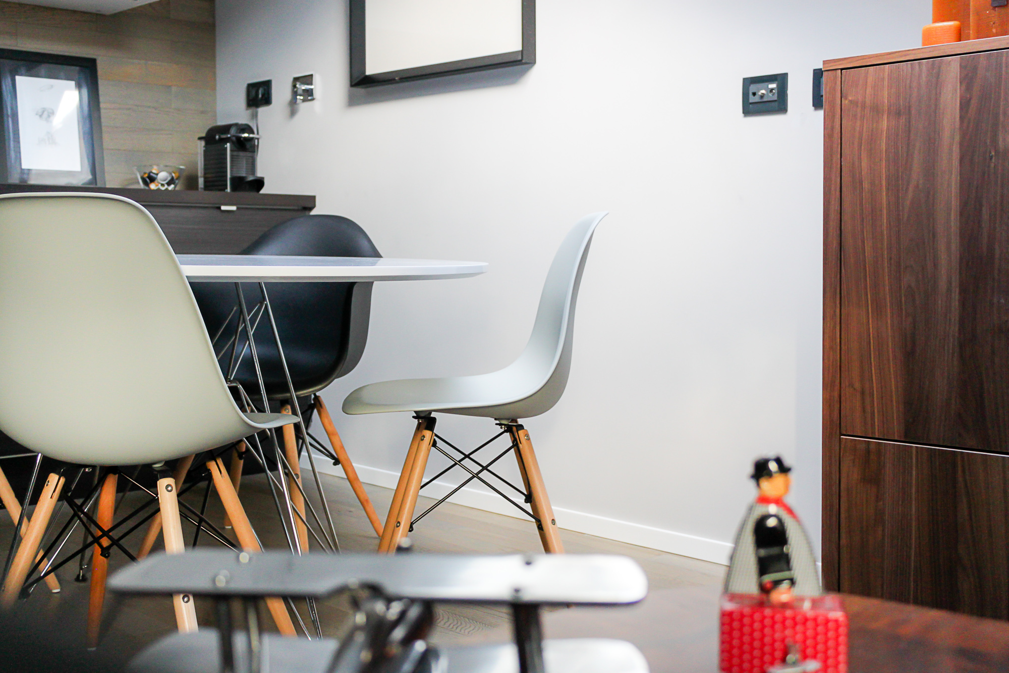
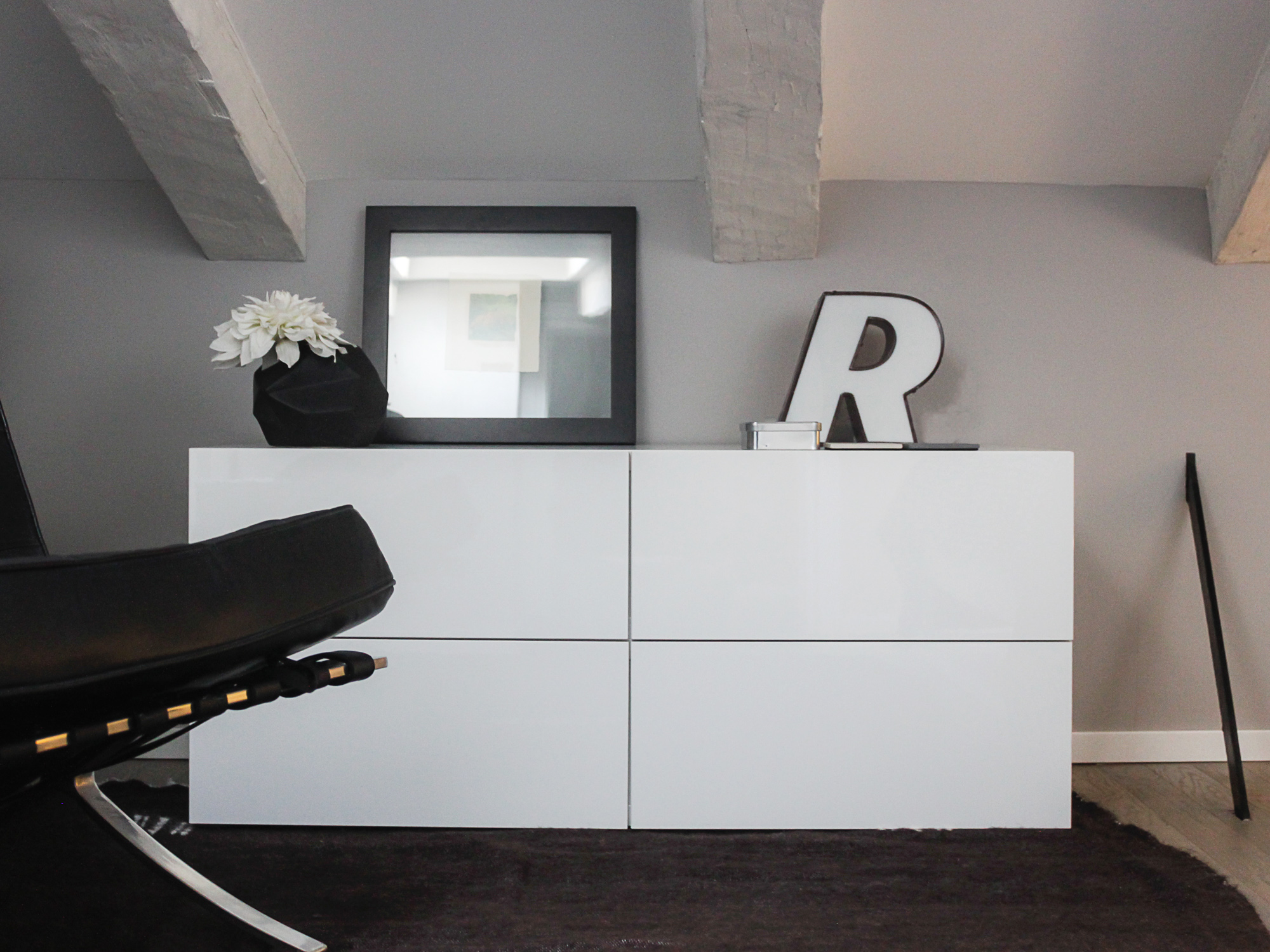
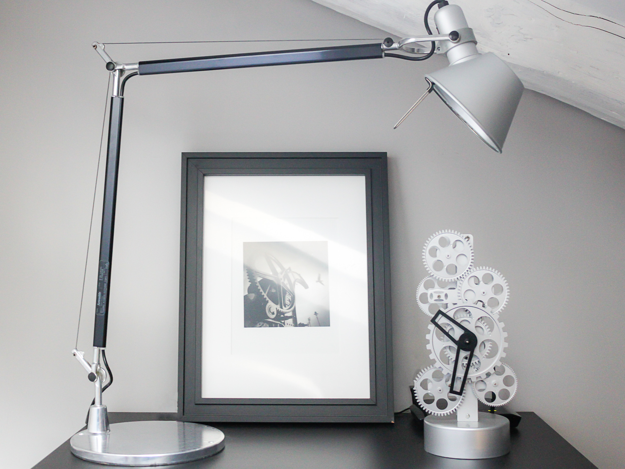
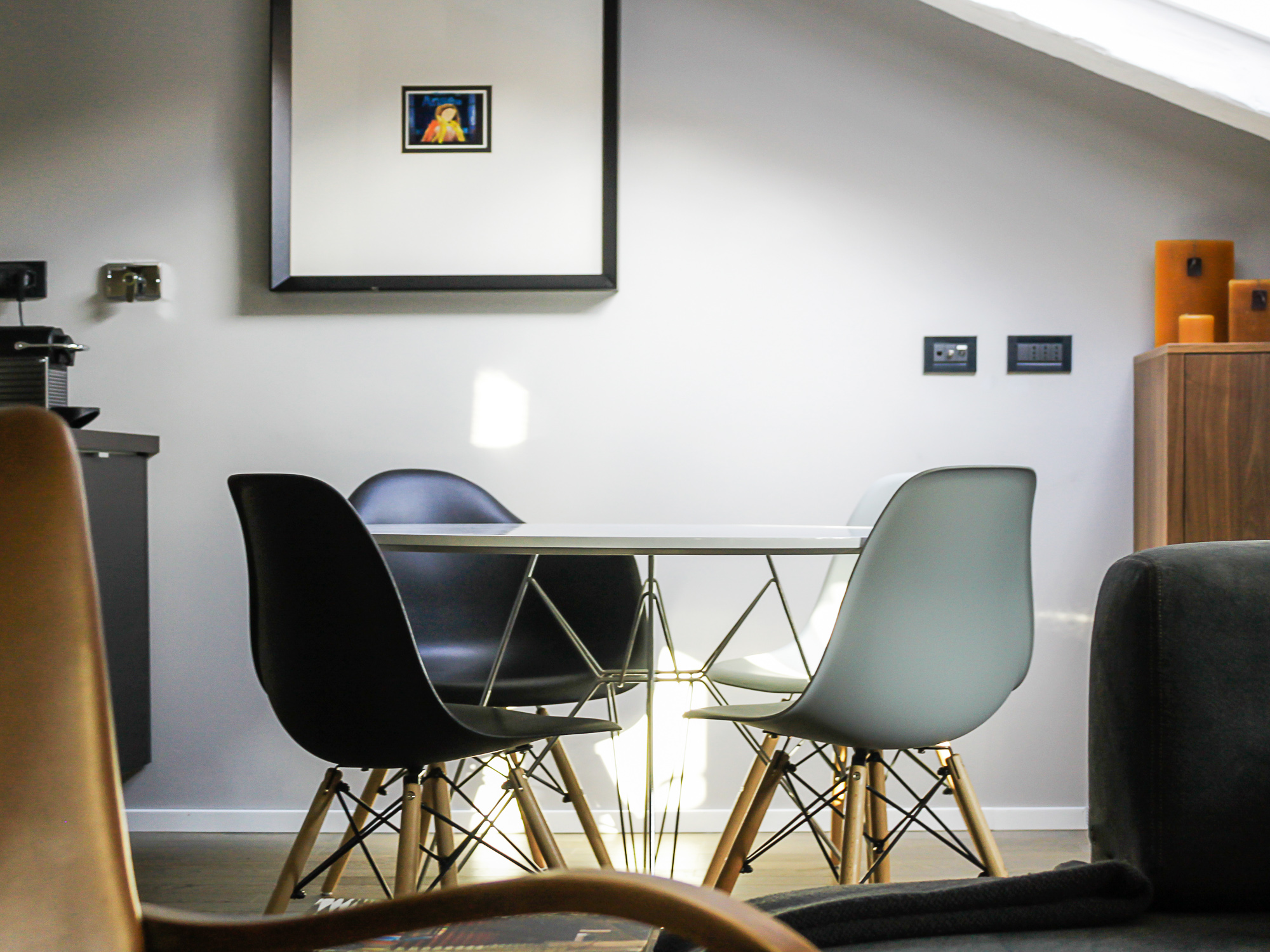
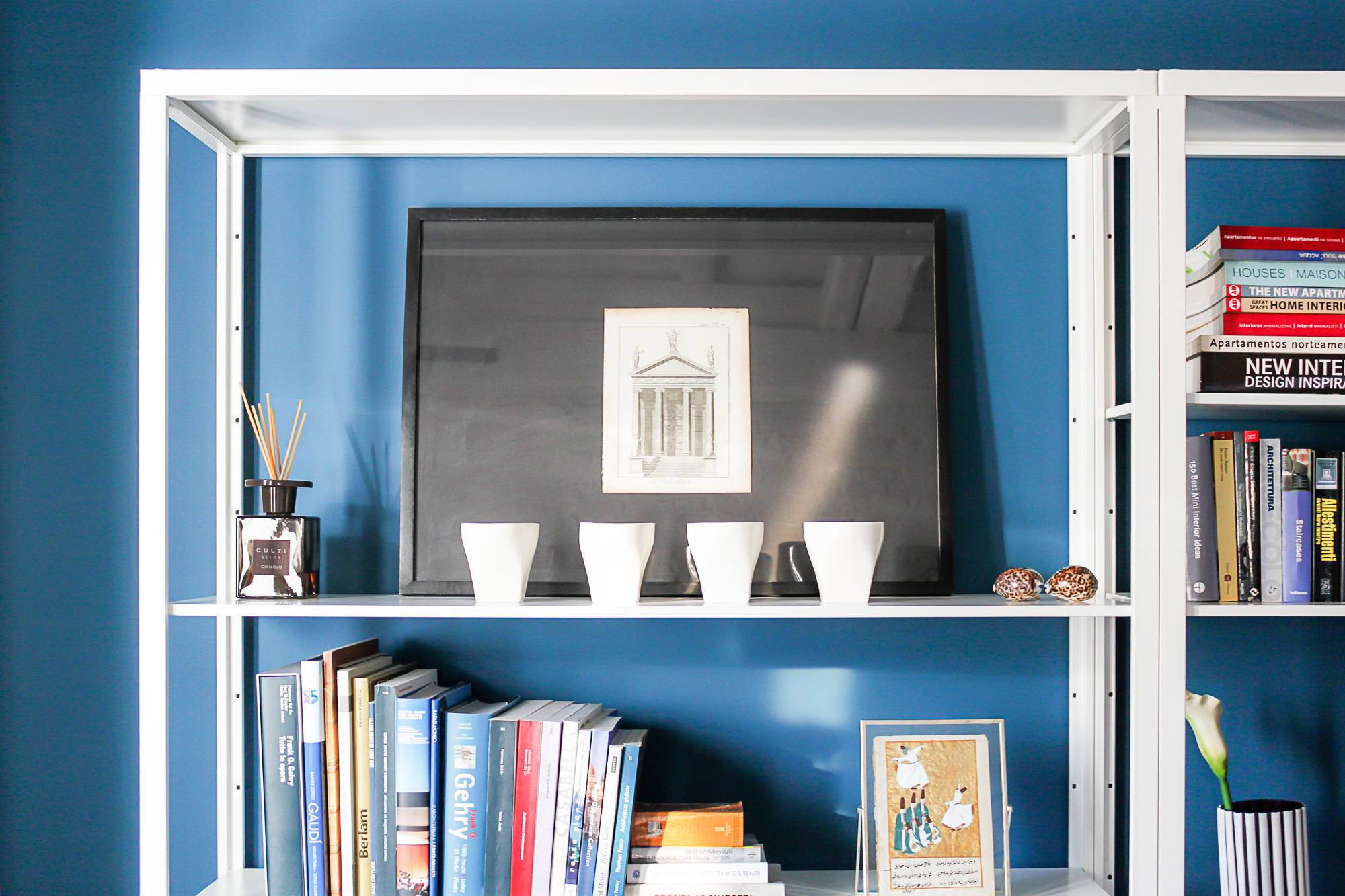
Once all the spaces had been well defined we now had a little space for creativity. How could we comply with the client’s requests who wanted an elegant, welcoming and sober look? Just a few simple choices: whitening out the wooden beams and brick walls so it looked less rustic, giving it an old loft look, with a wooden dove-grey floor, and paint the walls a nice warm grey colour, simple white and dark grey furniture and a few notes of dark blue to give the room a little depth and e few vintage elements to give it a personality. Everything is then completed with a little artwork on the walls, design objects and Moroccan carpets, which were objects the owner found on some of his travels.
Et voilà! The job is done!


And remember: there’s no more demanding client than yourselves! The mad client was actually me! And it was a very difficult person to please. But at the end, what a result!
Ross
